*Content Warning*: This article contains graphic descriptions, images, and references related to the Holocaust. Some readers may find this content disturbing or upsetting.
Stories we should never forget
For many people today, the Holocaust doesn’t feel relevant; it’s alien to the world they know – simply an episode of history from the distant past.
It has never been easy to tell this story, one where human beings inflicted terrible suffering and destruction on each other. In many cases, much of the evidence has been destroyed. The surviving images and testimonies are often graphic and upsetting; for those who have never lived through such darkness, it can all feel surreal, even incomprehensible. And yet, keeping these stories alive is the only way to learn from them.
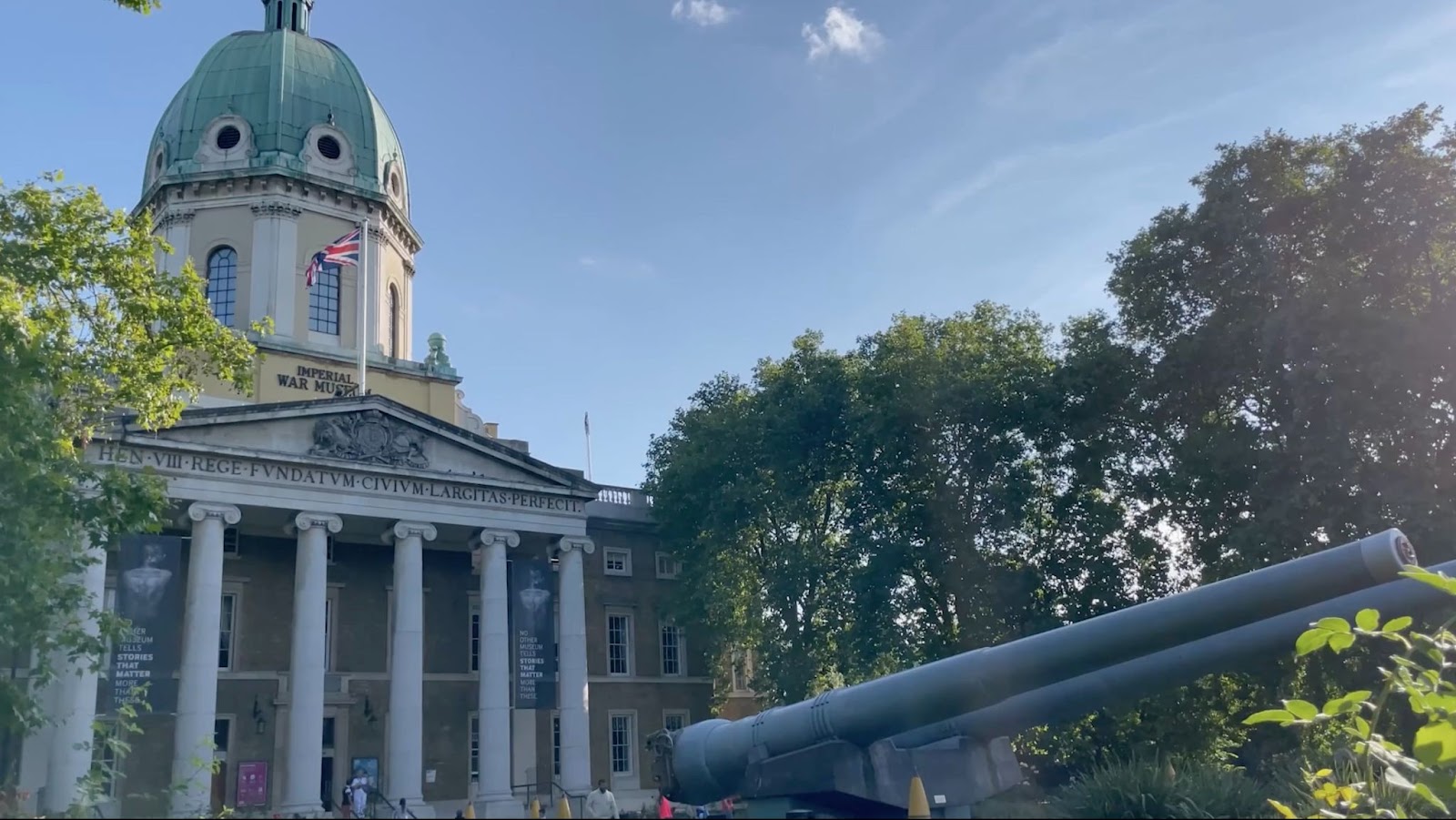
The Imperial War Museum (IMW) enlisted Squint/Opera’s help to do just that.
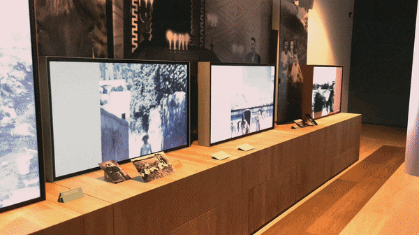
We worked closely with the exhibition curator, James Bulgin, a team of experts from the IWM, and the exhibition designer, Casson Mann. Together, we took a fresh approach to the story of the Holocaust, aiming to humanise the events from every perspective. In the process, we produced a wide range of media content for The Holocaust Galleries, 11 unique galleries, including digital exhibits, video installations, films and motion graphics. Through deep collaboration with curators and experts, we rethought our entire approach to digital media design to shed new light on this sensitive subject matter.
Illustrating Chaos
Many museum exhibitions about the Holocaust portray it as a highly planned and systematic event. In hindsight, the progression of events seems predictable, and the forces driving them seem organised. However, this top-down perspective doesn’t help a museum visitor imagine what it was like to live through this tragedy. It makes it difficult to understand why no one saw it coming or tried to stop it sooner or how such a thing might happen today.
In reality, the events of the Holocaust were chaotic and messy for those who experienced them first-hand. It wasn’t a machine that killed people—it was real human beings. Survivors often get asked why they didn’t try to leave, and the answer is simply that almost no one believed things would turn out the way they did. Even when Jewish communities were being rounded up in ghettos, few imagined the indiscriminate killings and mass death camps on the horizon.
Rough and Fragmented
To capture that sense of chaos, we deliberately cultivated a sense of discomfort in our visual style; we didn’t think a modern and polished treatment, which is so prevalent in much of our other museum work, was suitable. We wanted something that reflected the rawness and disorder of the human experience; it needed to be rough and fragmented, just like memories of these events.
So, we created a graphical style that was glitchy and disjointed, inspired by the technology of the era, using clacking typewriters and jumpy early film.
This approach displaces visitors from an objective, top-down view of the events. Instead, it encourages them to focus on people’s subjective experience of the Holocaust. It puts them at eye level with events and helps them imagine how something like this could—and did—actually happen.
Dealing with Explicit Assets
Our role was also to question elements of the briefs, which we sometimes thought were unnecessary or distracting. For instance, some of the content we had to exhibit is the worst imaginable, explicit depictions of violence, nudity, or deceased individuals; whilst being upsetting, these materials are also vital to the public’s understanding of events.
Nevertheless, we needed to consider how such sensitive materials should be presented, in an exhibit meant to engage people aged 14 and above.
Ultimately, We believed in presenting assets in their most authentic form.
Afterwards, we could consider presentation details that would affect how people engaged with those assets: how large they appear on the screen or projection, where they’re placed (perhaps elevated or concealed for adult-only viewing), and whether to display an image or video in its original state or incorporate it into a visual treatment.
In this way, none of the history is compromised or censored; it’s an unflinching view of events, but it also moderates the emotional response of visitors.
Implicit Storytelling
Explicit assets are an essential part of telling the story of the Holocaust, but the context surrounding the worst moments—what led up to them or what followed—can potentially evoke an even stronger emotional response.
An implicit approach to storytelling leaves room for viewers to bridge the gaps, drawing them into an active role where they can emotionally and intellectually unlock the meaning of a narrative.
Recreating Missing Pieces
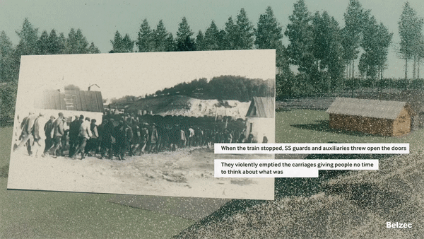
As the Nazis retreated, they destroyed much of the evidence of the concentration camps; most were turned to rubble and no longer exist, and few photos survived from when the camps were in operation. This makes it hard to convey what it was like to be in those places.
To represent this missing human aspect, creative use of what little evidence there is would be vital. We used a rare series of photographs taken at Auschwitz, to piece together the terrible journeys people endured in the camp, a step-by-step timeline from disembarking the transport trains all the way to the gas chambers.
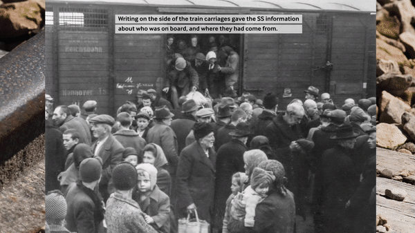
Rather than a broad overview or a magnified interrogation of one aspect of life in Belzec or Auschwitz, this narrative-focused approach aims to present a clear picture of events in order, as they occurred, from beginning to end, using what evidence remains to its full effect.
How do you portray memory?
Many Holocaust exhibits use architectural fly-throughs to show what the camps looked like. But again, this type of digital rendering is slick, smooth, and clean. It puts the viewer above it all, looking at the big picture from all angles. That’s not how the prisoners or guards saw it. Their experience of the space was grounded, limited, and clouded by emotion & memory.
However, overviews of the camps are a useful narrative device to help us understand the mechanisms that enabled the perpetration of crimes. So, instead of generic fly-throughs of digital renderings, we used a ‘point cloud’ illustrative technique to depict the camps, which involves using 3D arrays of dots to model objects and spaces; this effect gives the visualisation a hazy, almost ghostly quality, in this way they imitate how we recollect events in our minds.
Over this stylised depiction, we added relevant photography and text to contextualise the architecture and highlight its significance in the story of the Holocaust. The result is an emotional experience rather than an intellectual one, which keeps the human element of the Holocaust continuously in focus.
Conveying Scale
The events of the Holocaust occurred in many places over the course of more than a decade, and we wanted visitors to understand this at both intimate and grand scales.
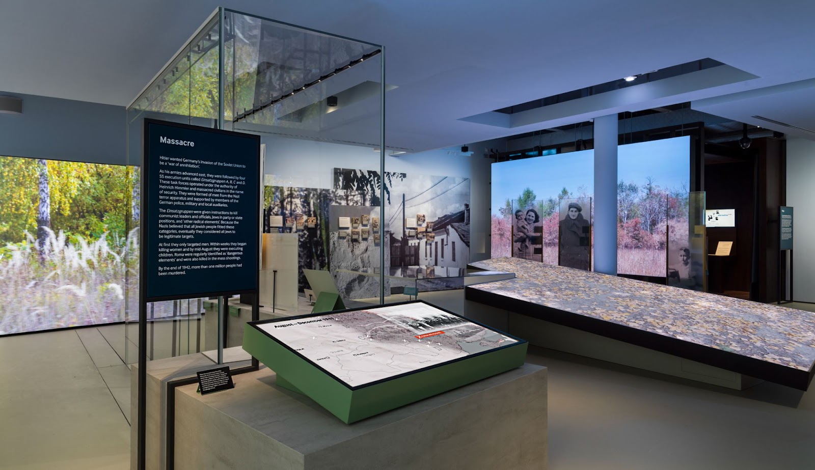
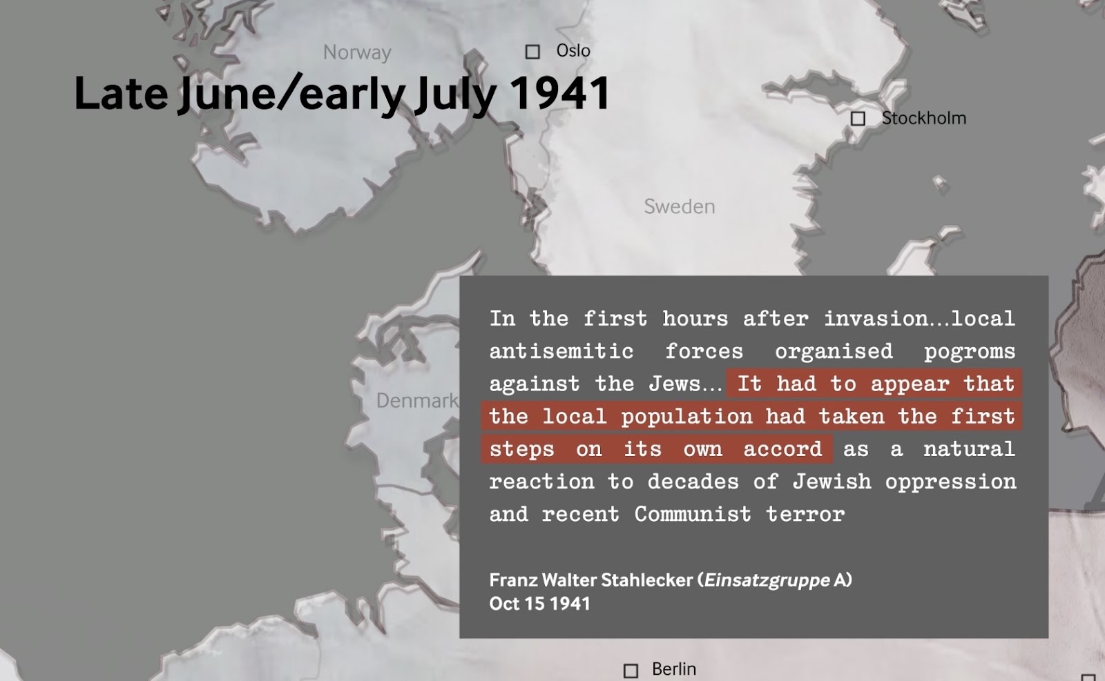
To highlight the pervasive, inescapable nature of the violence, events that aren’t featured in many representations of the Holocaust were brought to light. For example, many Holocaust exhibits focus on the death camps. Still, few tell the story of the Einsatzgruppen mobile killing squads, who followed the German army and executed Jews as the invasions progressed.
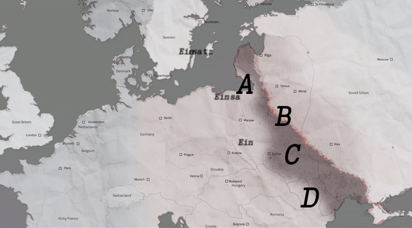
In this part of the exhibit, we used testimonies from the perpetrators of these crimes to highlight not just the mass movements of armies but the human-scale violence that happened along the way.
Detailing the Holocaust through Data
Squint helped to create two key exhibits that transform data into visual narratives, aiding visitors to comprehend the vast scale and intricate involvement of multiple parties in facilitating the events of the Holocaust.
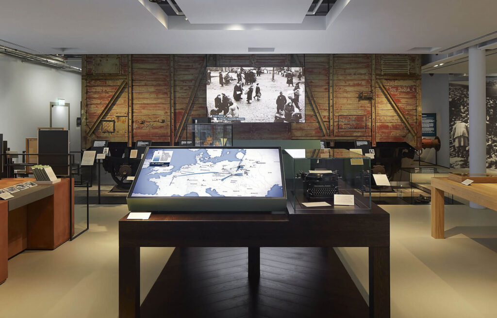
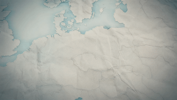
Squint worked with IMW to create an animated infographic map, ‘The Deportation Map,’ which details the deportation of Jewish communities and persecuted minorities during the Holocaust.
Based on historical records from IMW and various Holocaust museums across Europe and the US, the map shows a timelapse of hundreds of train journeys across Europe, over three years.
We individually mapped the journey of each train as accurately as possible, with a line thickness corresponding to the number of people deported. This proved an effective means to humanise the overwhelming numbers involved in these journeys, helping audiences grasp the gravity of the events.
This was the first time the IWM team had seen their data in such a visual form.
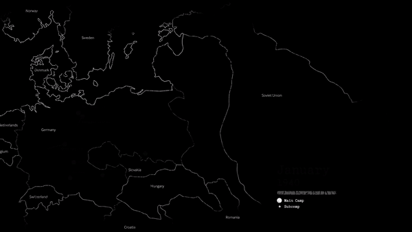
We did the same for the ‘Slave Labour Map’, an exhibit which details the development of slave labour camps across Europe over five years from 1940-1945.
Witnessing the scale and progression of these deportations and slave labour camps, with animations marking significant events and movements, could help historians, researchers, and visitors discern specific patterns and critical moments in the mass movement of individuals associated with the Holocaust; potentially even helping to refine our understanding of events.
The Holocaust within the Social Fabric
Another exhibit, the ‘Complicity Map’, deals with societal complicity and collaboration in events that led to the Holocaust. Instead of focusing on pure data, this exhibit takes an artifact-based approach.
It brings to light various campaigns, posters, official documents, photographs, and other cultural materials that reflect how railways, businesses, and entire countries sometimes knowingly or unwittingly contributed to the atrocities. Mapping objects in this way highlights the many layers and nuances of complicity that existed beyond the obvious acts of violence.
The museum seeks to remind its viewers that the events of the Holocaust were not isolated but rather deeply embedded in the social fabric of the time. Visitors are encouraged to reflect on the broader implications of societal collaboration in such horrific events through this exhibit.
Honouring the Memory
At the conclusion of these galleries, multiple films capture poignant interviews with Holocaust survivors. Spanning over 20 hours, this uncut footage was minimally edited for practicality; for instance, the footage was reconfigured from landscape to portrait, but was otherwise deliberately untouched.
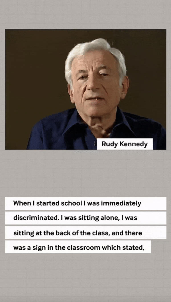
Shot in the decades following the war, these compelling testimonials serve as a stark reminder of the harrowing reality survivors faced, emphasising individual, personal experiences amidst a broader historical context.
This powerful design choice intentionally contrasts with the rest of the exhibit, giving survivors the last word, in their own terms.
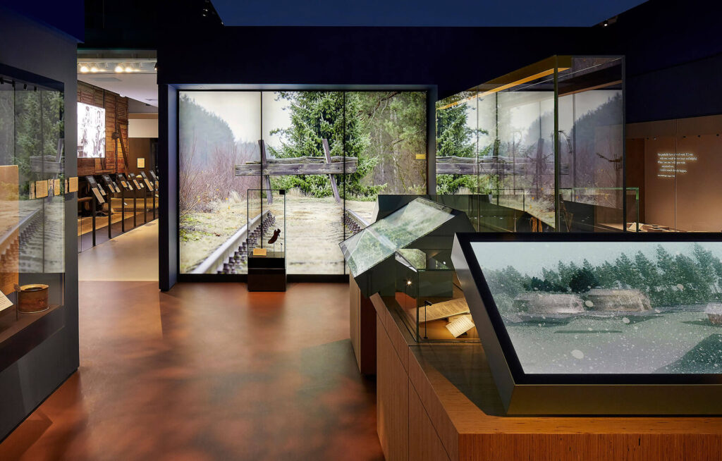
Exhibition design
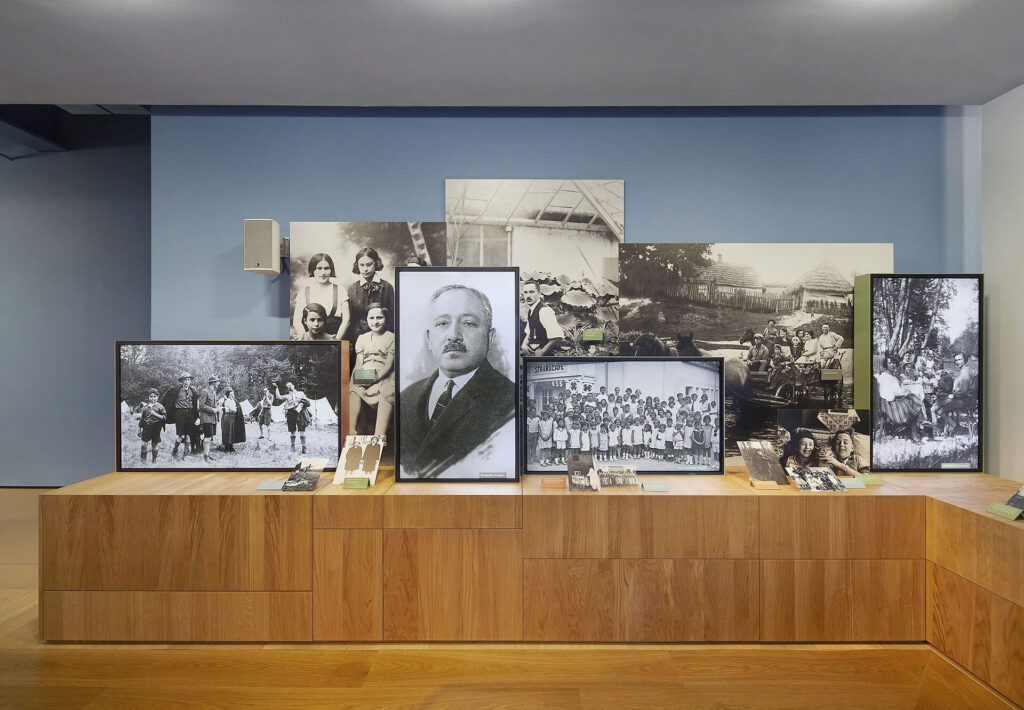
The Galleries themselves aim to portray reality without sensationalising it. Instead of a closed, dark colour palette to underscore the tragedy of these events, the spaces – designed by Casson Mann – are well-lit and painted in muted tones of blue and green. This creates an atmosphere of transparency, enabling visitors to focus on the exhibits. The overall effect is to emphasise how these crimes against humanity happened in plain sight, at the centre of ‘civilised’ Europe.
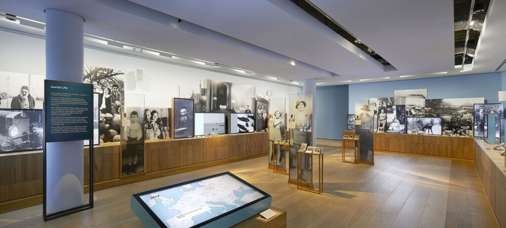
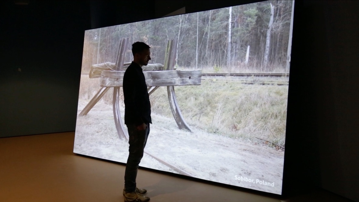
Similarly, rather than modernising and magnifying the evidence, Casson Mann presented physical materials in their most raw, authentic forms. Photographs from the death camps are displayed at the scale in which they were originally taken, and there are no dioramas of concentration camps. Sites associated with the Holocaust were filmed as they look now, enabling visitors to recognise that the genocide happened in a world very much like ours.
Honouring the Future
In the end, this re-imagined approach to immersive content and gallery design creates a thought-provoking and emotive environment that allows visitors to reflect on a difficult subject without being overwhelmed. It invites them to close the distance between past and present by seeing the story of the Holocaust not through the grand sweep of history but through the eyes of the real people who experienced it. In this way, the exhibit revitalises the memory of this atrocity and the lessons to be learned from it, which are as urgent and relevant as ever.